 The name of the film suggests it is a thriller genre as the name used is very mysterious, therefore automatically engages a character with questions about the film, as well as introducing them to the main character and what the film is based upon. Also 'dragon' has connotations of fear and density in typical thriller films, therefore again, shows the audience that the thriller is going to be fearful and bold, just like a dragon would be. This creates interest as the viewers want all the questions they are asking to be answered within the film. The target audience is shown to be anybody that takes particular interest within this type of genre.
 The film title design further communicates meaning to the audience about genre, meaning and story as the font used is San Serif, typical for Thriller films as it is spaced, easy to read yet very bold within the screen. The colour of the text is white, having connotations is purity and boldness. The size of the font on the screen is very large, placed within the middle of the scene, sometimes filling the width of the screen, sometimes not. I think it depends on what is being said (however I cannot read Swedish).
 The actor included within the titling and opening scene of the film is a hooded character, whose identity is hidden throughout the opening sequence that the audience will question is the girl with the dragon tattoo. This creates enigma for the audience as well as giving a dramatic background for the whole sequence. Actors within the film are introduced alongside the characters movement, placed side by side. Smaller font is used alongside as possibly the lest important actors name are placed in a smaller font rather than the main characters being placed within the larger font.
 Within the sequence, the relationship between the title and credit information and the background of the frame is linked as the font is put in whatever space is clear when the character is walking to the designated location. The reasons for it being affective are purely because the editors need to place the names of everyone involved within the film, however, are placing it whilst the scene is going on so that they do not waste time in going into the action.
The sound used throughout the opening is non-digetic, placed within minor key and are wrapped around a variety of foley's depending on the movement that the character is doing. The non-diegetic music only occurs in the middle of the titling sequence, again creating enigma as it has a sense of dramatics and a build up to what is going to happen next.
Lovely Bones

The name of the film suggests it is a thriller genre as the name used is very mysterious, therefore automatically engages a character with questions about the film, as well as juxtaposing the theme of death with bones. The name creates a sense of psychotic and creepy atmosphere due to that specific juxtaposition within the title. This suggests that it is used to un-nevre the audience. As well as this, again, typical for an thriller sequence, San Serif is used to be seen bold and easily read within the beginning of this film. Again, the font is placed in white as it slows purity as well as standing out on screen.
The size of the font on the screen is very large, placed within the middle of the scene. This suggests the importance of the title sequence and that the editors want the viewers to know what this film is having connotations of. However, the beginning of the opening does not fit the title so far therefore viewers are going to keep their attention and keep watching the film to see why the film is called Lovely Bones.
The actor included within the titling and opening scene of the film is a female character - guessing a child of the male figure within the scene also. The identity is shown throughout the opening sequence that the audience will automatically get to know and recognise as the main character. This typical opening does not fit a typical Thriller opening as it starts out with a voice over followed my non-diegetic, major key music about how this girls life is progressing.
 Within the sequence, the relationship between the title and credit information and the background of the frame is linked as the font is put in whatever space is clear when the shot is taking up a long space of time. This particular thriller does not do the same as The girl with the dragon tattoo. It does not automatically introduce the names of characters. However, I do not think it does till much later within the opening sequence. This suggests that what is going on within the opening is far more important than names of actors.
 The sound used throughout the opening is non-digetic, placed within major key and are wrapped around a voice over of what seems to be a first person story of the girls life. The non-diegetic music only occurs in the middle of the titling sequence, only to when the 2 adults are shown within the sequence. Creating enigma to who they are and what is going on.
Pulp Fiction
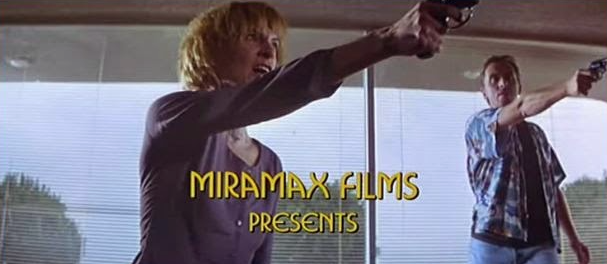
The credits appear with a background of two characters, one female and one male. The female characters facial expression looks very angry, and both of the characters are pointing a gun to something/someone which can't be seen in the frame. This constructs the thriller genre because the gun is suitable iconography for a thriller, and it creates anticipation for the spectator, creating enigma and also suggests something of what the film is about. Institutional information is presented in yellow text, which catches the spectators attention easily. The font is very rounded rather than sharp edged, which doesn't clearly demonstrate a thriller atmosphere however it suits the non-diegetic music which gives a feel of adrenaline.
 The name of the film suggests it is a thriller genre as the name used is very mysterious, therefore automatically engages a character with questions about the film. The word 'pulp' has the idea of something being small and grounded up. The word fiction suggests exaggeration and falseness.
 Therefore this suggest a small insight to what the film will be about. A small life in which is false, almost unbelievable. Possibly linking to the characters presented straight away as they're very fake, getting away with the robbery within the cafe. The series of credits leading up to the titles are displayed on a black screen, which demonstrates the thriller genre and gives a spooky feel.
The yellow text symbolises high quality. It's associated with joy, happiness, intellect, and energy. Therefore as we are focusing on something that is fiction- unreal, and fake.

Within the title sequence, the title slowly rises into the frame, and then stops in the frame, covering all of it. The bold, big text is displayed on top of a black screen and the font looks 3D. Again, the font is yellow therefore creating a sense of high quality and links with the name of the film. However, has used a orange background to make sure that the font stands out to anybody viewing.
Panic Room

The credits appear on top of an establishing shot, this gives us an insight on where the film is set. The font of the institutional information is white and small in the centre of the frame.
The scene cuts to another establishing shots, with more credits being displayed however from a different angle. The font looks as if it is coming out of the frame in comparison to the background image, giving a mysterious look.
 Non-diegetic music is playing through-out the credits which sounds like it is building up to something, creating enigma. Also, there is diegetic sound of car horns, and various other sounds coming from the background. The shots cut to different credits, all with an establishing shot background. where the font varies in size and angles. There is a panning shot where the credits pan into the frame.
The title pans into the frame over an establishing shot of buildings. The font of the title reflects in the building in the background image, this demonstrates the thriller genre because it is mysterious.
The non-diegetic music deepens at the title enters the frame, and the font is bold and larger than the previous titles. The titling is put over the sequence therefore not wasting time to engage the audience straight away.
No comments:
Post a Comment